The Singapore Pavilion
at the Shanghai World Expo in 2010 is to be called Urban Symphony – a
tribute to how Singapore houses a delicate harmony of cultures
coexisting together in a city-state.
Designed by Kay Ngee Tan Architects,
the theme is best expressed in the pavilion’s architecture, one which
evokes images of a musical box. It forms an orchestra of elements and a
symphony for the senses – from the choreography of the plaza’s water fountain, the rhythm of fenestrations on the façade, the interplay of sounds and visuals, to the mélange of flora on the roof garden.
Pictures and exhibits of
Singapore adorn the way to the atrium space and main hall of the first
floor, where visitors will enjoy various activities; taking in
performances right up to the expanse of the second floor’s column-free
open space. Topping off
Singapore’s reputation as a much-admired garden city is the rooftop’s A
Garden in the Sky, which ably captures the essence of life in
Singapore. More info in the pavilion’s official website. More images and a video after the break.
-

-

-

-

-

پروژه دوم:
Huanacu Warehouse & Office / tFPS
© nico saieh
Architects: tFPS
Location: Santiago, Chile
Project team: Eduardo Fam Mancilla, Diego Pinochet Puentes, Leonardo Suárez Molina
Structural engineer: José Manuel Morales
Site area: 3,128 sqm
Constructed area: 1,670 sqm
Project year: 2006-2009
Photographs: Nicolas Saieh & tFPS
")
")

")
This Project, our first project as
architects, started in 2006. It sets as the perfect projection of three
recently graduated (in fact… graduating) architectural student´s
concerns, about the discipline´s approach to the architectural project: One
related to the formal exploration, a playfull one that can lead us to a
differentiation to historical types of common architecture (typical
boring boxes). Another, related to a rigorous technical approach (so the
formal exploration can emerge in the reality), and finally a strong
commitment, with elemental life situations that define the architecture
(formal and technical approaches).
formal diagrams
The project can be described through three points.
The assignment
A big warehouse (with
administrative offices and showroom), a “cool one”( just as the client
request), one that can “stands out” in contrast to the typical
industrial architecture of the close context of the project, but… as
cheap as we can produce it (aprox $430 USD/sqm). A form that could
respond to the internal logics of the company´s operation (charge and
discharge of products, exhibition of these products in the showroom,
administrative operations, etc).
© tFPS
floor plans
The restrictions
-
A limited budget (enough to build a typical warehouse)
-
Strict regulations of the zone (an industrial park near to the main airport of the city)
-
About the internal operations of the company
This led us to a fundamental question: How can we operate on the form, responding to the requirements of the client and the building regulations of the zone, and beside fit into the small budget?.
© nico saieh
The equation that defines the
problem was clear: client demands + building regulations demands + tight
budget = a cool and unique building. Clearly , not an easy one…
The first approach to the problem
solution, came from the idea of concentrate all the efforts to the
exposed facades of the building (The site was defined by two streets),
generating “perimeter activated by the program”(where liberties about
building regulations were less strict) and leaving the production activities protected to the inside of the site.
model
The formal operation or “where final architecture emerge”
How to operate on the form, then?,
Where to start?. Taking the basic idea of a normal box (basically, a
typical storage building …a big shed) inverted. We started to think
about this strong image , and the formal logic that we can explore and
explode , to transform ( starting from the same surface area of the
initial box), the most exposed faces of the building to receive the
critical activities demanded for the client.
We use of a typical structure of industrialized steel frames
(to let us have less cost in structural calculations) , but operating
from the folding of the skin (finally, the cheapest and more workable
object in technical terms).
© tFPS
A series of foldings (mainly three
operations), allowed us to generate the two fronts, that in terms of
proportions and surface area, are the same of a regular industrial
building, so in that way we can insert the different activities of the
program and elemental situations (showroom, administrative facilities,
truck access, etc):
Access: A first folding that
allowed the access to the showroom through the corner, recognizing from a
single view the two folded facades of the building.
© nico saieh
Work and view: A second folding of
the west facade generates the office volume, allowing the views (the
main demand of the client) to the future “los maitenes” park (hoping it
will be ready in a year or two), separated from the industrial
activities and with as much natural light as possible.
Work and production: Generating the
larger folding to “rio itata” street, a big five meter overhang that
forms the roof protecting the loading and unloading activities from rain
and strong sun, connecting this space fluidly with the rest of the
building.
پروژه سوم:
November 16th, 2009
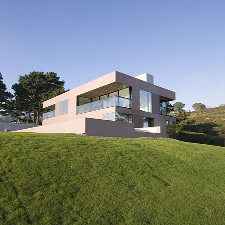
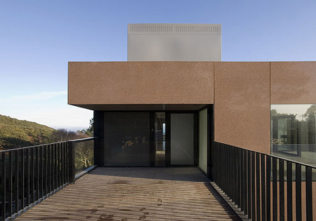
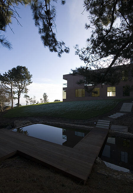
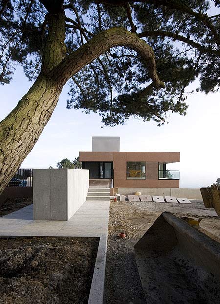
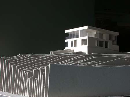
Dublin practice FLK Architects have completed a precast concrete residence overlooking Dublin Bay in Howth, Ireland.
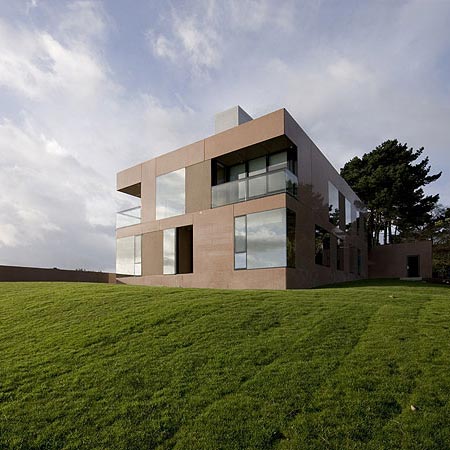
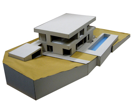
Called Precast House, the project comprises three separate volumes emerging from the sloping site – a house, garage and swimming pool.

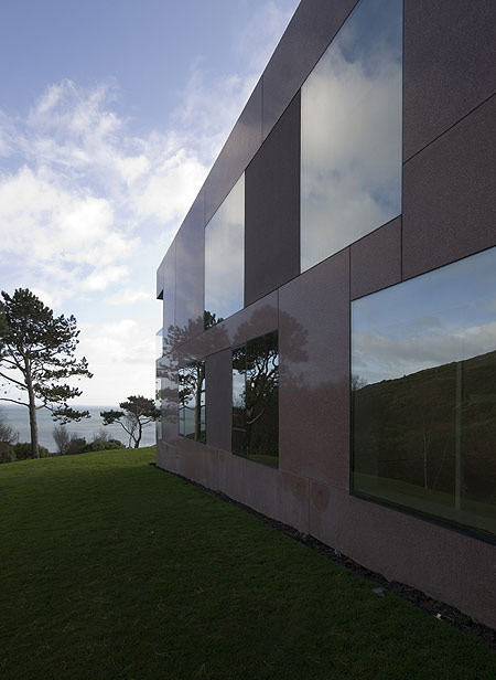
The three buildings are made of polished precast concrete,
combined with large windows and glass balustrades to reflect the
surrounding landscape.
More about FKL Architects on Dezeen: A House
Photographs are by Verena Hilgenfeld.

Here’s some more information from the architects:
–
Precast House
The site is long, sloping, falling towards cliffs and the sea.
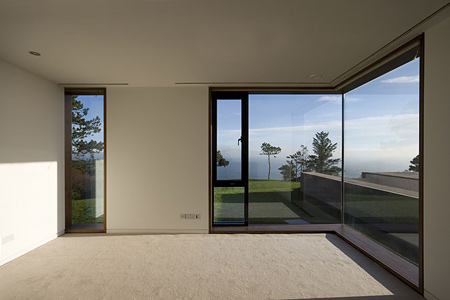
Entering the site the viewer’s eye is drawn to the horizon, the viewer is pulled towards the abstracted line.
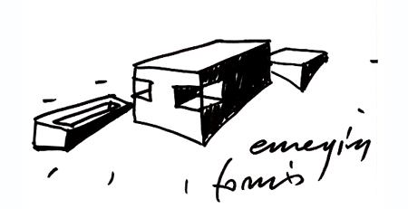
The project is defined in conceptual terms as three
discrete forms – garage, house and swimming pool – each emerging from
the landscape, their respective heights being determined by the use of
each form.
The relationship between the three elements is a casual one, slipping past each other, sliding towards the sea.
The three forms are detailed in the same manner and use the same material, polished precast concrete.
The surface tension across the facades is maintained by the flush detailing of the windows and the glass balustrades.

The reflected landscape is visible in both materials glass and polished precast concrete.
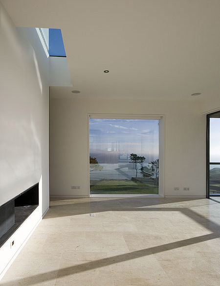
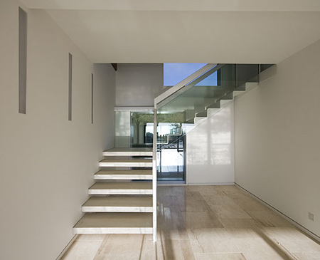
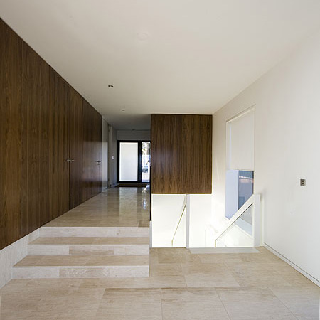
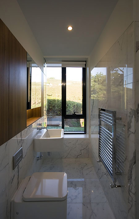
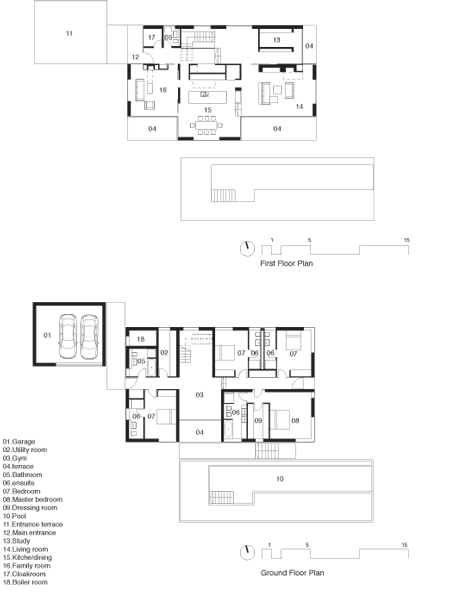
At first floor level (entry level) the plan is open with the primary living spaces and entrance having an overlapping relationship.

Within the field of the first floor a number of walnut
clad timber elements are slipped between floor and ceiling planes,
defining the flow of the space and adding richness to the interior.
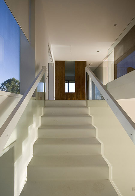
At ground floor level (sleeping level) the situation is more introverted.
The figure ground relationship is the reverse of the first
floor, the plan is treated as a solid mass that has been carved out to
make a cruciform circulation space with the bathrooms and bedrooms
retained inside the remaining form.


")


")
")


")